Berkeley Certificate in Design Innovation - Rebrand
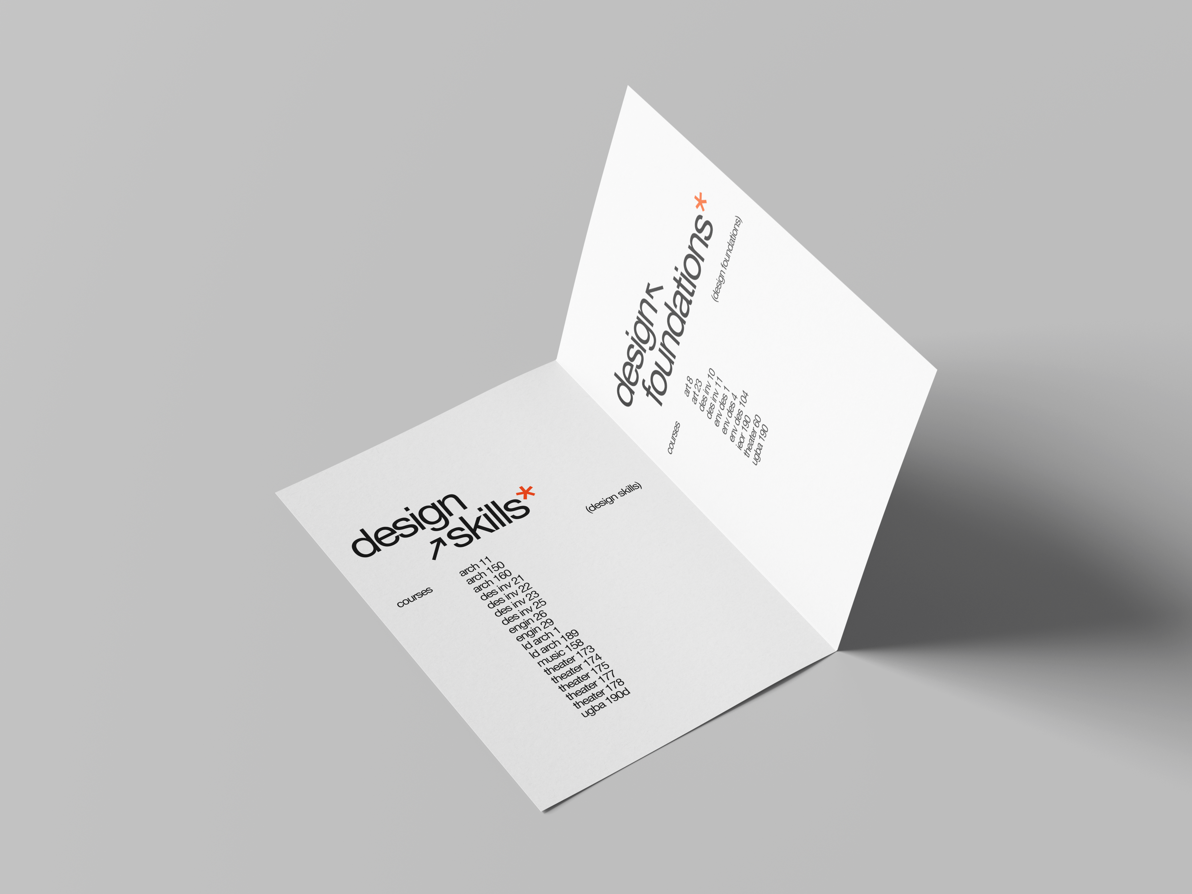
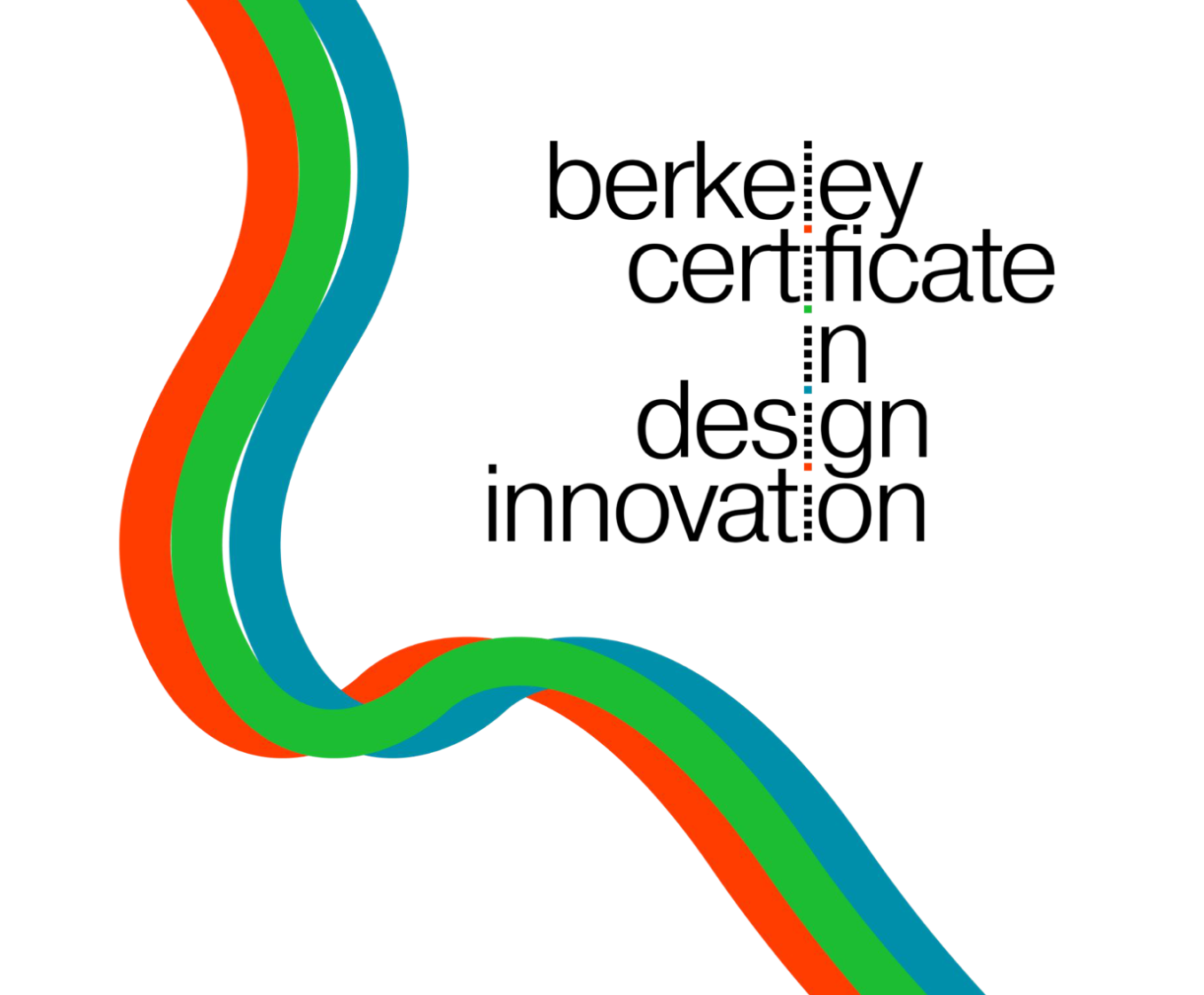
This project struck me when I received an email from the Berkeley Certificate in Design Innovation program (which I’m completing now in college) and was surprised to see that the existing brand for this design program lacked a coherent design language (see below). I felt the immediate, irrepressible urge to tidy up the branding.
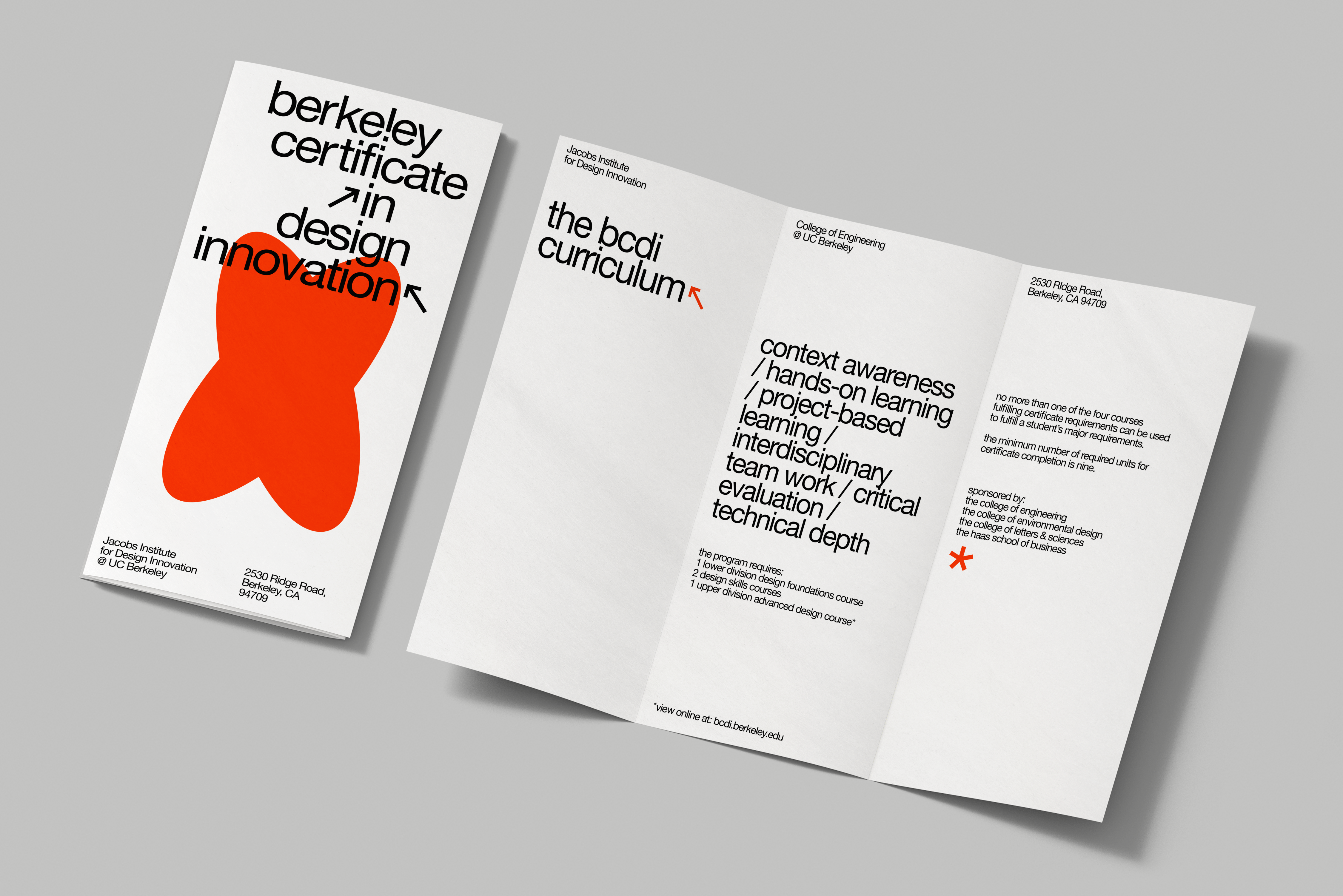
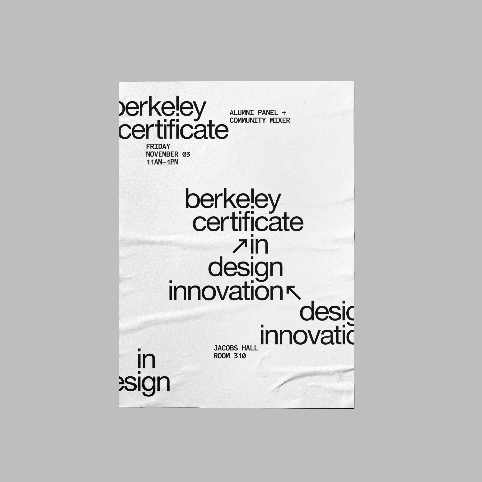
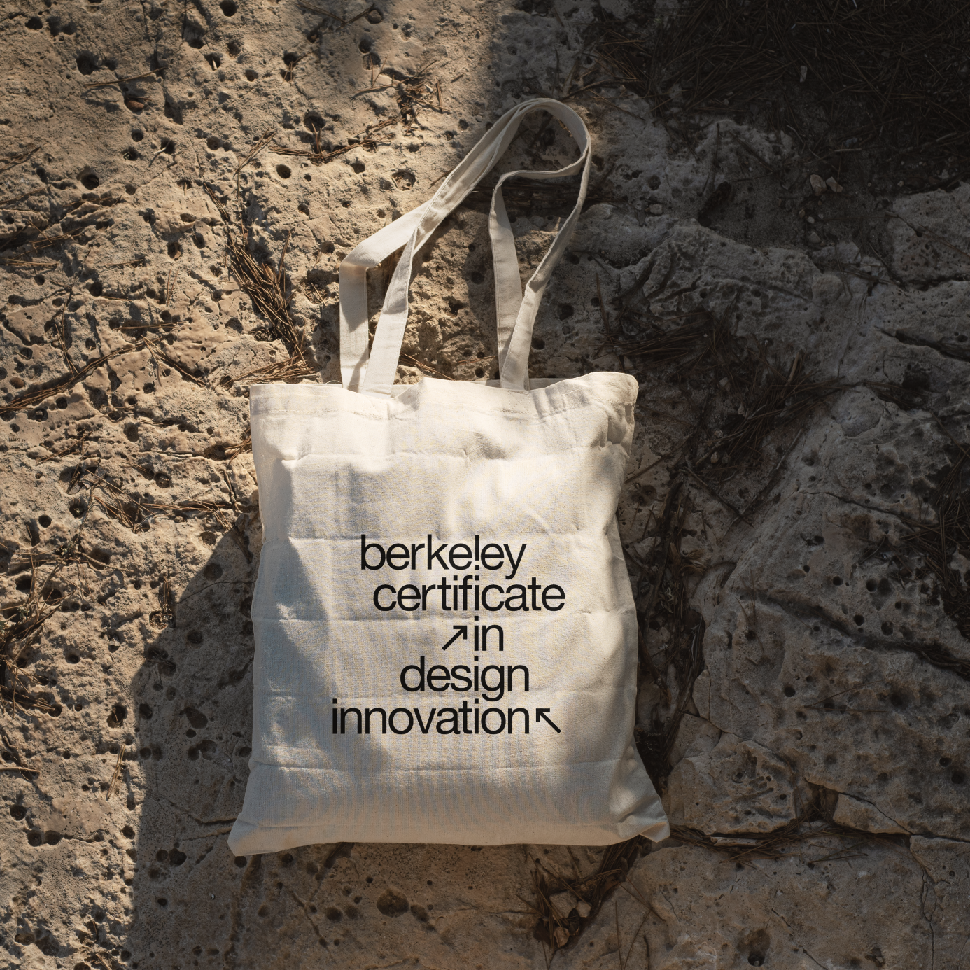
What I arrived at is a simplified, practical reimagining of the old brand. I’ve kept the playful layout of the word mark (where the l’s and i’s in each word align), but cleaned up the spacing and kerning, adding arrow icons to the lockup. The arrows denote progress, focus, and function, which are all core tenets of the BCDI program. The font for the word mark is Helvetica Neue—what I felt was a practical choice, while also paying homage to Swiss type design & the well-renown design schools from that era.
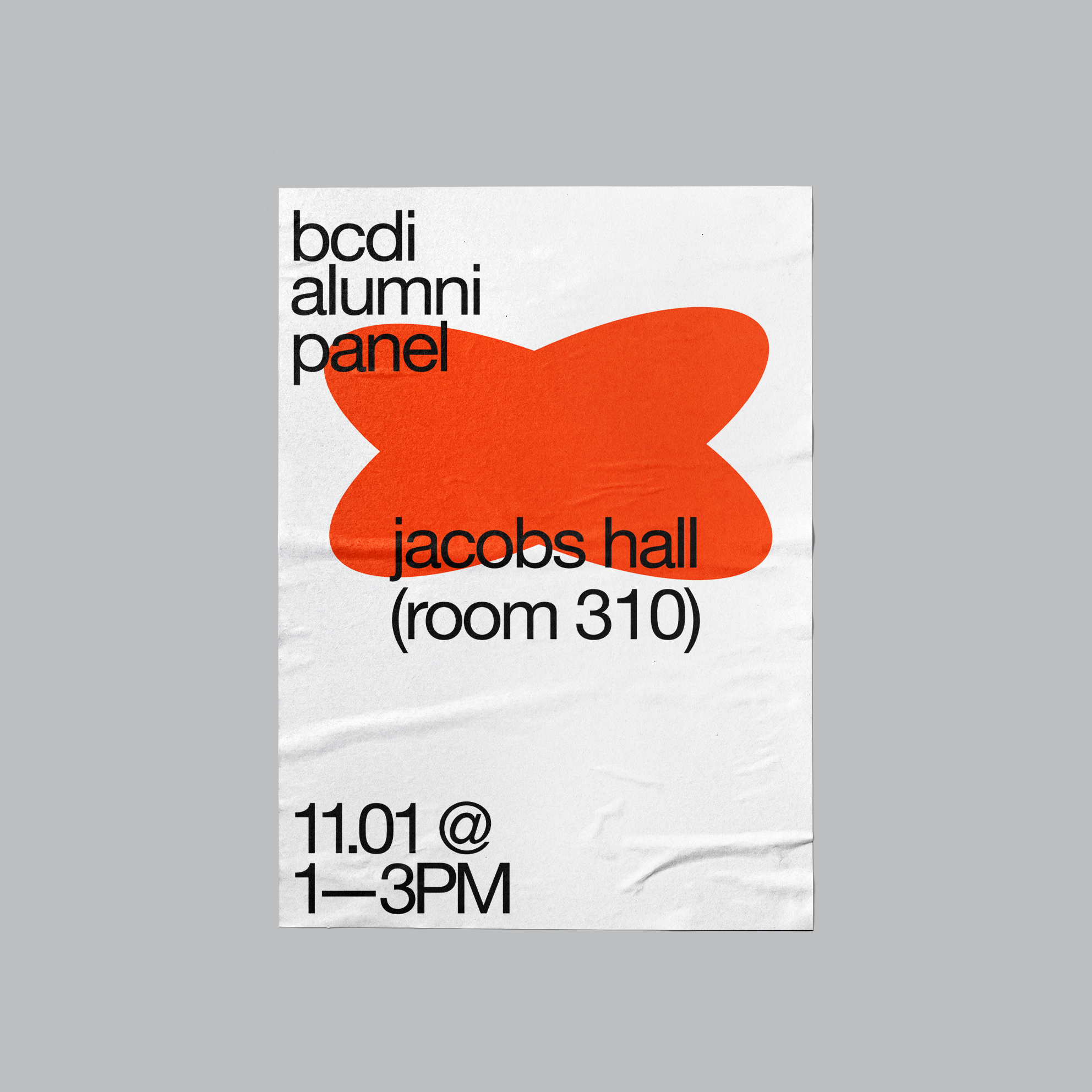
Unlike the old branding, this rebrand has only one accent color: the electric orange (pulled from the old brand). It is to be used sparsely, for emphasis and occasionally for shapes. It breathes life and vibrancy into the brand, reflecting the creativity and passion of BCDI’s students.
The new branding for BCDI is playful, pragmatic, and sophisticated. It embodies the program’s mission to solve problems through design, embracing the life cycle of design.
2023
Existing brand:
![]()
This project struck me when I received an email from the Berkeley Certificate in Design Innovation program (which I’m completing now in college) and was surprised to see that the existing brand for this design program lacked a coherent design language (see below). I felt the immediate, irrepressible urge to tidy up the branding.
What I arrived at is a simplified, practical reimagining of the old brand. I’ve kept the playful layout of the word mark (where the l’s and i’s in each word align), but cleaned up the spacing and kerning, adding arrow icons to the lockup. The arrows denote progress, focus, and function, which are all core tenets of the BCDI program. The font for the word mark is Helvetica Neue—what I felt was a practical choice, while also paying homage to Swiss type design & the well-renown design schools from that era.
Unlike the old branding, this rebrand has only one accent color: the electric orange (pulled from the old brand). It is to be used sparsely, for emphasis and occasionally for shapes. It breathes life and vibrancy into the brand, reflecting the creativity and passion of BCDI’s students.
The new branding for BCDI is playful, pragmatic, and sophisticated. It embodies the program’s mission to solve problems through design, embracing the life cycle of design.
2023
Existing brand:
BCDI Rebrand (2023)
![]()
![]()
![]()
![]()
![]()
![]()
![]()
![]() .
. ![]()
![]() .
. ![]()
![]()





 .
. 
 .
. 
